


Colorado Avalanche
The Colorado-Avalanche logo stands as one of the most recognizable emblems in professional hockey. Bold, dynamic, and rich in symbolism, the Colorado-Avalanche logo captures the spirit of both the team and the Rocky Mountain region it represents. From its dramatic “A” design to the swirling snow imagery, every detail reflects movement, power, and identity.
Since the franchise relocated to Denver in 1995, the Colorado Avalanche logo has remained largely consistent—an unusual feat in modern sports branding. While many teams frequently redesign their marks, the Avalanche have refined and strengthened their visual identity without abandoning the original concept that fans embraced from day one.
In this comprehensive guide, we’ll explore the history of the Colorado-Avalanche logo, its symbolism, design elements, color meaning, alternate marks, branding evolution, and its cultural impact in the NHL.
The Origins of the Colorado Avalanche Logo
The franchise began as the Quebec Nordiques before relocating to Denver and rebranding as the Colorado Avalanche ahead of the 1995–96 NHL season. With a new city came a new name—and the need for a powerful identity.
The Colorado-Avalanche logo debuted alongside the team’s first season in Denver, immediately signaling a fresh start. Unlike some expansion teams that experiment heavily with designs, the Avalanche launched with a bold, fully realized emblem that has endured for decades.
The timing proved perfect. In their inaugural season under the Colorado-Avalanche logo, the team won the Stanley Cup, instantly embedding the symbol into championship history.
Breaking Down the Colorado Avalanche Logo Design
The Colorado-Avalanche logo is layered with meaning and visual storytelling. Let’s examine its primary elements.
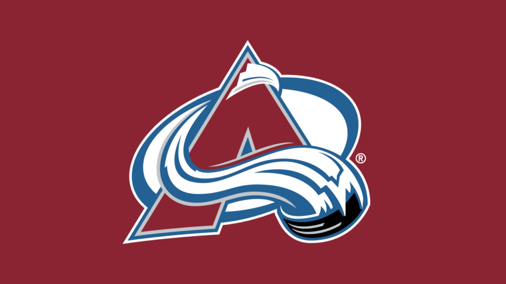
The Stylized “A”
At the center of the Colorado-Avalanche logo is a large, sweeping capital “A.” This letter represents:
- Avalanche
- Altitude (a nod to Denver’s elevation)
- Athletic dominance
The sharp, angular structure gives the logo a rugged, mountainous feel.
The Snow and Avalanche Motion
Flowing around the “A” is a swirling arc of snow, designed to resemble an avalanche cascading down a mountain. This movement element adds:
- Energy
- Speed
- Aggression
The puck embedded within the snow swirl reinforces the hockey identity of the Colorado-Avalanche logo.
Mountain Imagery
Hidden within the negative space of the “A” is a subtle mountain peak, referencing Colorado’s iconic Rocky Mountains. This detail anchors the Colorado-Avalanche logo firmly in regional identity.
The Meaning Behind the Colorado Avalanche Logo Colors
The Colorado-Avalanche logo features a distinctive color palette:
Burgundy
Burgundy represents strength, determination, and intensity. It sets the Avalanche apart from traditional red-heavy NHL teams.
Steel Blue
Steel blue reflects Colorado’s cold winters and mountainous terrain. It also adds balance and depth to the logo.
Black and White Accents
Black outlines add contrast and boldness, while white symbolizes snow and ice—central themes of the Colorado-Avalanche logo.
The combination creates a visually striking emblem that remains unique within the league.
Evolution of the Colorado Avalanche Logo
One of the most fascinating aspects of the Colorado-Avalanche logo is how little it has changed. Since 1995, only minor refinements have been introduced, including:
- Subtle color adjustments
- Modernized line sharpness
- Updated digital formatting
Unlike many franchises that undergo dramatic rebrands, the Avalanche have maintained consistency. This stability has strengthened brand recognition and fan loyalty.
The Alternate “C” Logo
In addition to the primary Colorado-Avalanche logo, the team also introduced an alternate mark featuring a bold “C” wrapped around a puck.
This secondary logo symbolizes:
- Colorado pride
- State identity
- Simpler merchandise branding
The alternate design appears on shoulder patches and third jerseys, offering versatility while maintaining connection to the main Colorado-Avalanche logo.
The Colorado Avalanche Logo and Championship Legacy
The Colorado Avalanche logo quickly became associated with success. The team won the Stanley Cup in:
- 1996
- 2001
- 2022
Each championship deepened the prestige of the Colorado Avalanche logo. Seeing the emblem engraved on the Stanley Cup solidified its place in NHL history.
Championship banners hanging in Ball Arena prominently feature the Colorado Avalanche logo, further reinforcing its iconic status.
Fan Connection to the Colorado Avalanche Logo
Sports logos often transcend design—they become emotional symbols. The Colorado Avalanche logo represents:
- Community pride
- Playoff triumphs
- Legendary players
- Generational fandom
Fans wear the logo on jerseys, hats, and memorabilia as a badge of loyalty. Over time, the Colorado Avalanche logo has become synonymous with resilience and competitiveness.
Merchandise and Global Recognition
The Colorado Avalanche logo appears across a wide range of merchandise, including:
- Authentic NHL jerseys
- Vintage throwback apparel
- Collectible memorabilia
- Video game branding
Its distinctive burgundy-and-blue palette stands out in sports retail spaces. International NHL growth has also expanded the global visibility of the Colorado Avalanche logo.
Comparing the Colorado Avalanche Logo to Other NHL Logos
Within the NHL, logos often reflect regional geography or team names. The Colorado Avalanche logo excels in combining both.
For example:
- The Detroit Red Wings use a winged wheel symbol.
- The Chicago Blackhawks feature a Native American head profile.
- The Vegas Golden Knights showcase a knight helmet emblem.
The Colorado Avalanche logo distinguishes itself by incorporating motion—visually depicting an avalanche rather than just a static symbol.
Typography and Branding Consistency
Beyond the main emblem, the Colorado Avalanche logo works seamlessly with the team’s typography.
The bold, angular font mirrors the sharp lines of the “A” in the logo. This consistency ensures:
- Strong visual identity
- Brand cohesion across platforms
- Instant recognizability
From arena signage to social media graphics, the Colorado Avalanche logo remains central to all branding efforts.
Modern Digital Adaptation
As digital platforms evolved, the Colorado Avalanche logo was optimized for:
- High-resolution streaming
- Mobile applications
- Social media avatars
- Broadcast overlays
Clean vector lines ensure that the logo maintains clarity on small screens and large jumbotrons alike.
Cultural Impact of the Colorado Avalanche Logo
The Colorado Avalanche logo represents more than hockey—it symbolizes Denver’s emergence as a championship city. Alongside teams like the Denver Broncos and Denver Nuggets, the Avalanche contribute to Colorado’s sports culture.
The logo frequently appears in:
- Downtown murals
- Fan art
- Community events
- Youth hockey programs
Its presence extends beyond the rink, embedding itself into Colorado identity.
Why the Colorado Avalanche Logo Has Endured
Longevity in sports branding often depends on three factors:
- Strong initial design
- Championship association
- Fan attachment
The Colorado Avalanche logo meets all three criteria. Its dramatic visual storytelling, combined with on-ice success, has prevented the need for major redesigns.
In a league where rebranding can sometimes alienate fans, stability has proven advantageous.
The Future of the Colorado Avalanche Logo
While the core design is unlikely to change drastically, the Colorado Avalanche logo may see:
- Special edition variations
- Anniversary throwback designs
- Reverse retro adaptations
However, the primary emblem remains foundational to the franchise’s identity.
Final Thoughts on the Colorado Avalanche Logo
The Colorado Avalanche logo is a masterclass in sports branding. By blending mountain imagery, motion symbolism, and a distinctive color palette, it captures the essence of Colorado hockey.
From its debut in 1995 to multiple Stanley Cup championships, the Colorado Avalanche logo has remained a powerful and consistent symbol of excellence. Its design tells a story of speed, strength, and regional pride—qualities that define the franchise itself.
For fans and design enthusiasts alike, the Colorado Avalanche logo stands as one of the NHL’s most successful and enduring emblems, representing both a team and the powerful natural force that inspired its name.
READMORE : bossmagazines.co.uk